A cohesive brand identity build that serves as a hub for the organization’s resources and community engagement.


Hope for Pain is a medical non-profit organization dedicated to providing resources and support for individuals suffering from chronic pain. They approached me with a desire to build a brand that would resonate with their audience and communicate their mission clearly and effectively.
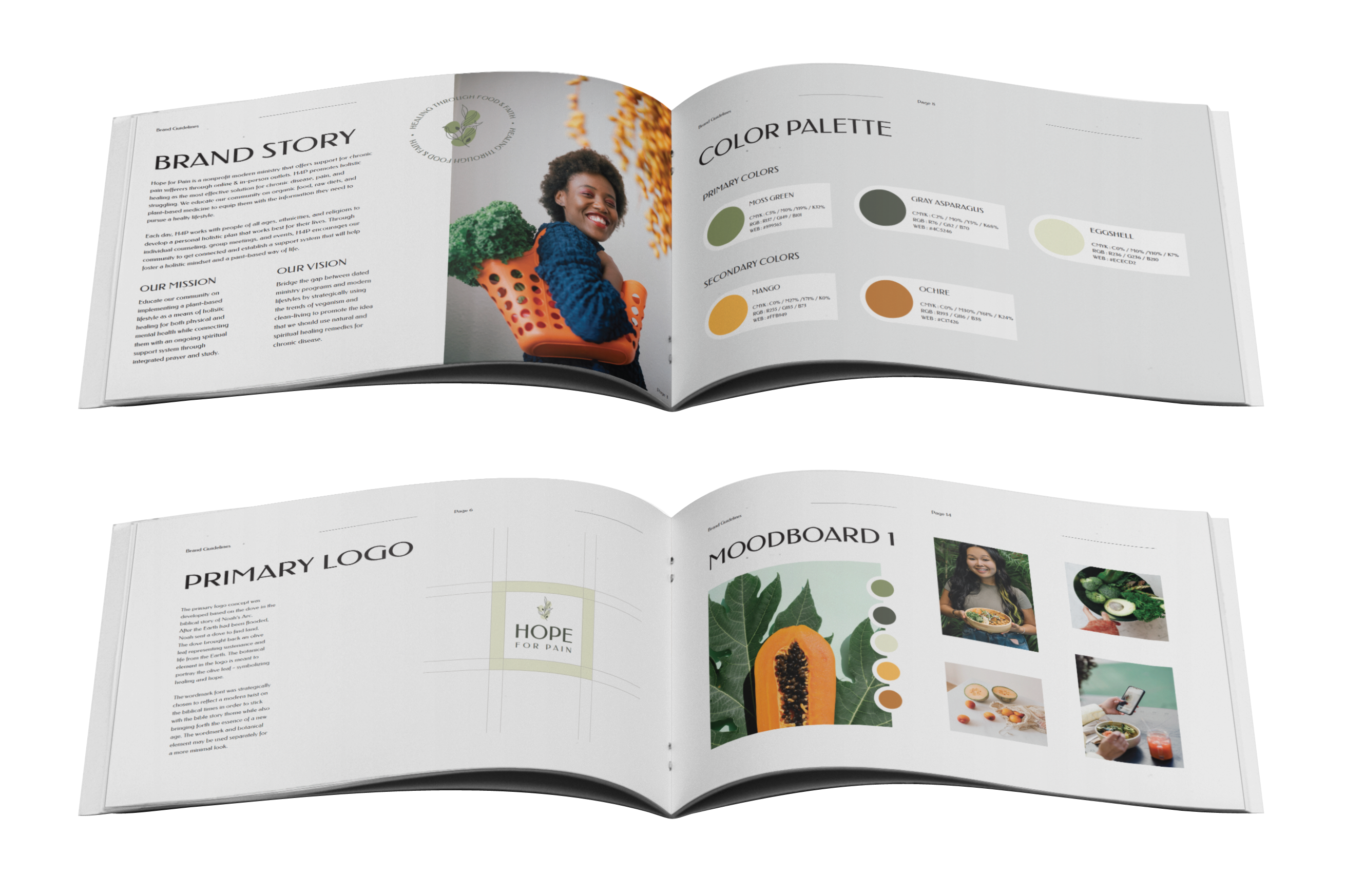
To create a brand that accurately reflects Hope for Pain’s mission and values, I began by developing a brand story that captured their unique identity and vision. Through collaboration with the client, I identified key messaging and visual elements that would be central to the brand’s identity and allow their audience to come together in unison with a common goal of healing.

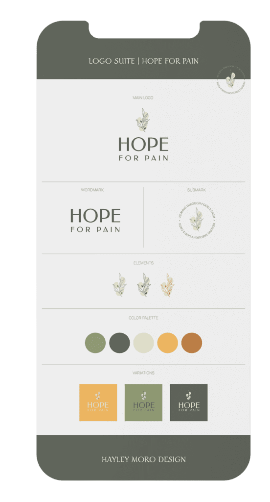
To create a cohesive and memorable brand identity for Hope for Pain, I carefully crafted a logo suite and brand guidelines that would convey the organization’s unique values and mission. The logo suite features a botanical, interconnected symbol that represents the idea of hope, unity, and holistic healing with a color palette that conveys warmth, compassion, and vitality. The symbol was developed through a process of ideation and refinement, with several iterations and design directions explored before settling on the final design. The color palette was also carefully selected to convey the emotions and values associated with the organization.
The brand guidelines established standards for typography, color usage, and other key design elements, ensuring that the brand would be consistent across all touchpoints. Through collaboration with the client, we were able to develop a brand identity that accurately reflects Hope for Pain’s mission and values, and sets them apart as a unique and trusted resource for individuals suffering from chronic pain.
Brand Story
Logo Suite
Color Palette
Typography
Application

In addition to the brand development process, I also designed and built out a website that would serve as a hub for Hope for Pain’s resources and community engagement. The website design process began with a thorough understanding of the organization’s needs and goals, as well as an analysis of their target audience and competitors. I then developed wireframes and user flow diagrams to plan out the structure and functionality of the website, ensuring a user-friendly and intuitive experience. From there, I moved on to the visual design stage, creating a clean and modern interface that emphasizes the brand’s messaging and mission.
The new brand and website have been met with overwhelmingly positive feedback from both the client and their audience. By communicating Hope for Pain’s mission and vision clearly and effectively, the new brand has helped to raise awareness and support for individuals suffering from chronic pain. The clean, user-friendly design of the website has also helped to improve engagement and increase user traffic.
UX/UI Design
WordPress Development
SEO Optimizations
Performance Tracking
Let’s designcreateideate together!
Don’t be shy, drop me a line! Let’s discuss how we can bring your design ideas to life. Whether you’re an established brand looking to implement design thinking methods or a start-up in need of a full brand development package, I’m here to help.
Let’s collaborate to create something extraordinary that truly reflects your brand’s personality and message. Let’s make some magic!
© Hayley Moro Design – 2023